
Documentation
- 1. General Introduction About Project
- 1.1 Idea
- 1.2 Idea Development
- 1.2.1 Brainstorming Categories
- 1.2.2 Techniques for Ideation in Design
- 1.2.3 Primary Goals and Selection of Project Topic
- 1.2.4 Popularity of the Human Body as a Topic
- 1.2.5 Assigning Responsibilities
- 1.2.6 Team Responsibilities
- 1.3 Narrative and Sub-Narrative Structure
- 2. Design Specifications
- 2.1 Visual Design
- 2.1.1 Color Scheme
- 2.1.2 Color Usage
- 2.1.3 Typography
- 2.1.4 Layout and Grid System
- 2.1.4.1 General Layout Principles
- 2.1.4.2 Homepage Layout
- 2.1.4.3 Exhibition Page Layout
- 2.1.4.4 Narratives and Map Page Layouts
- 2.1.5 Iconography and Imagery
- 2.2 Technical Design
- 3. Attribution Information
- 3.1 Public Domain Mark
- 3.2 Attribution 4.0 International (CC BY 4.0)
- 3.3 Attribution-NonCommercial 4.0 International (CC BY-NC 4.0)
- 3.4 Attribution-ShareAlike 4.0 International (CC BY-SA 4.0)
- 3.5 Attribution-ShareAlike 3.0 Unported (CC BY-SA 3.0)
- 3.6 Attribution 2.0 Generic (CC BY 2.0)
- 3.7 Icons
- 4. Conclusion
1. General Introduction About Project
1.1 Idea
Welcome to our project for the Information Modelling and Web Technologies course. This project embarks on a fascinating journey into the microscopic world, presenting a collection of 19 meticulously curated images of cells, bacteria, and human body organs.
Our mission is to create an engaging and educational web experience that showcases these images within the context of a virtual exhibition at Palazzo Pepoli in Bologna.
The central theme of our project revolves around the narratives and sub-narratives that structure and enhance the viewer's understanding of the images. By organizing the data into coherent and interrelated stories, we aim to transform the collection into a rich tapestry of scientific discovery and human anatomy.
1.1.1 List of Pictures
- Tooth with bacteria
- Microplasma
- Staphylococcus aureus
- Clostridium difficile colony
- Stromal Lymphocytes
- Red Globules
- Human hair
- Purkinje neurons
- Tongue
- Blood vessels in the optic disc
- Blood vessel in a melanoma
- Healthy hair bulb
- Alveoli
- Collagen
- Intestinal villi
- Section of an eye (1)
- Section of an eye (2)
- Blood vessel
- Human proximal tubule
1.1.2 Narratives and Sub-Narratives
- Systems: Circulatory system, Digestive system, Immune system, Integumentary system, Muscular system, Nervous system, Respiratory system, Skeletal system, Urinary system
- Type: Bacterium, Cell, Organ
- Technique: Lithography, Scanning Electron Microscopy (SEM), Scanning Electron Microscopy, colorized, Transmission Electron Microscopy (TEM)
- Period: Historical, Contemporary
- Dimensions: From the smallest to the biggest
1.1.3 Objectives
- Educational Value: Provide detailed information and context about each image to enhance understanding of microscopic structures and their significance in human biology.
- Interactive Experience: Utilize web technologies to create an interactive and immersive exhibition that encourages exploration and curiosity.
- Narrative Integration: Employ a narrative-driven approach to data organization, ensuring that each image is part of a larger story that connects with the viewer on multiple levels.
- Aesthetic Presentation: Design the website with a focus on visual appeal and user-friendly navigation, reflecting the elegance and historical significance of Palazzo Pepoli.
Welcome to a world where the unseen becomes visible, and every image tells a story.
1.2 Idea Development
We began our project with a comprehensive brainstorming session, focusing on the most critical aspects of web development. Our approach was rooted in an iterative design process. Utilizing notes for publication, we brainstormed and gathered intriguing ideas.
This cycle was split into two phases:
- In the first phase, we generated a wide array of ideas.
- In the second phase, we organized and selected the most promising ones.
1.2.1 Brainstorming Categories
- Information Architecture: We considered how to structure and present information effectively.
- General Graphic Design: We explored various visual styles and design principles.
- User Interface: We designed for both desktop and mobile applications.
- User Experience: We focused on creating an intuitive and engaging experience for our users.
1.2.2 Techniques for Ideation in Design
For our brainstorming sessions, we employed several ideation techniques, such as mind mapping, affinity diagrams, and the SCAMPER method (Substitute, Combine, Adapt, Modify, Put to another use, Eliminate, Reverse). These techniques helped us explore a wide range of possibilities and ensure that no idea was overlooked.
Our two-stage approach to ideation was particularly effective for our project. By first generating a broad set of ideas and then narrowing them down, we ensured that we considered all possibilities before making any decisions. This method also allowed us to refine our concepts and focus on the most impactful solutions.
Through multiple brainstorming sessions, we were able to clearly define our development goals and principles. This clarity enabled us to distribute responsibilities equitably within our team, ensuring that each member could contribute their strengths to the project.
1.2.3 Primary Goals and Selection of Project Topic
Our exhibition focuses on micrographs of the human body. Initially, we considered including images of the broader biological world. However, after thorough brainstorming, we decided that concentrating on the human body would be more impactful for several reasons:
- Familiarity: Many people have a basic understanding of the human body. Iconic educational cartoons like "Il était une fois... la Vie" (Once Upon a Time... Life) and the anime "Cells at Work!" have popularized the subject.
- Educational Relevance: The human body is a topic covered in primary and high school curricula, making it familiar to a broad audience, including medical students.
- Personal Connection: People tend to be more interested in the human body because it directly relates to themselves.
1.2.4 Popularity of the Human Body as a Topic
Statistics show that the human body is a popular topic of interest. According to Google Trends, search queries related to human anatomy and physiology consistently rank higher than other biology topics. Educational platforms like Khan Academy and Coursera report higher enrollment numbers for courses on human biology compared to general biology courses. Additionally, children's educational programming featuring the human body garners significant viewership, indicating a widespread interest across age groups.
By focusing on the human body, we aim to leverage this inherent interest to create a compelling and educational exhibition that resonates with a wide audience.
1.2.5 Assigning Responsibilities
When dividing responsibilities, we adhered to a single principle: not to separate by techniques, but to share by functionality. This approach was crucial for us, as it ensured that every team member was involved in the application's development, thereby enhancing their hard skills.
By dividing responsibilities based on pages rather than specific tasks, we ensured comprehensive involvement across all aspects of the project. This method facilitated a more integrated and holistic development process.
1.2.6 Team Responsibilities
- Ludovica Benini and Alberto Ciarrocca: Responsible for the complete application development, encompassing everything from design to the creation of application navigation algorithms.
- Simone Casazza and Anna Pak: Tasked with developing the narrative page and the map page.
- Entire Team: Collaboratively developed the home page, ensuring a unified and cohesive entry point for the website.
1.3 Narrative and Sub-Narrative Structure
1.3.1 Storytelling Approach
Our approach to storytelling within the exhibition is designed to create an immersive and educational journey for the user. We aim to unfold a narrative that intertwines scientific discovery with personal connection, guiding users through the intricate world of human anatomy at a microscopic level. The narrative is structured to be both informative and engaging, utilizing a mix of text, images, and interactive elements.
The journey begins on the home page, where users are introduced to the overarching theme of the exhibition. From there, they can delve into specific sections that correspond to different systems of the human body, types of microscopic images, and the techniques used to capture these images. Each section tells a part of the larger story, gradually revealing the complexity and beauty of the human body.
We want users to experience a sense of wonder and curiosity, leading them to a deeper appreciation of the microscopic structures that make up their own bodies. The narrative is designed to evoke both intellectual and emotional responses, making the exhibition memorable and impactful.
1.3.2 Content Organization
To support the narrative, content is meticulously organized into coherent and interrelated categories:
- Systems: The exhibition is divided into sections based on different systems of the human body (e.g., Circulatory, Digestive, Immune, etc.). Each section provides detailed descriptions and images related to that system.
- Type: Content is categorized by the type of microscopic subject, such as bacteria, cells, and organs. This allows users to explore similar types of images and understand their relationships.
- Technique: We provide information about the techniques used to capture the images (e.g., Lithography, SEM, TEM), giving users insight into the scientific methods behind the visuals.
- Period: Images are also categorized by historical and contemporary periods, offering a perspective on the evolution of microscopic imaging.
- Dimensions: Content is organized by size, from the smallest to the largest structures, helping users grasp the scale of the microscopic world.
To maintain user engagement and coherence, we employ several strategies:
- Interactive Elements: Users can click on images to view detailed descriptions and related information, encouraging active exploration.
- Sequential Navigation: The content is presented in a logical sequence, guiding users through the narrative in a structured manner.
- Thematic Consistency: Visual and thematic consistency across sections ensures a seamless user experience.
1.3.3 User Pathways
Users can navigate the exhibition through multiple pathways, offering various routes and perspectives to explore the content:
- System-Based Navigation: Users can start with a specific body system and explore all related images and information within that section.
- Type-Based Navigation: Users interested in a particular type of microscopic subject can follow pathways dedicated to bacteria, cells, or organs.
- Technique-Based Navigation: For those curious about the scientific methods, pathways based on imaging techniques provide a focused exploration.
- Period-Based Navigation: Users can explore the historical evolution of microscopic imaging by following pathways organized by periods.
- Dimension-Based Navigation: Pathways based on size allow users to journey from the smallest to the largest structures, offering a unique perspective on scale.
Each pathway is designed to be intuitive and user-friendly, with clear labels and navigation tools to guide users through the content. This multi-faceted approach ensures that users can tailor their experience to their interests, making the exhibition accessible and engaging for a diverse audience.
2. Design Specifications
2.1 Visual Design
2.1.1 Color Scheme
2.1.1.1 Palette Selection
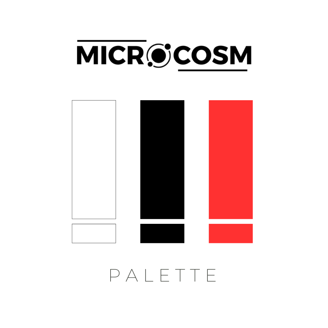
- Primary Color: White (#fff)
- Secondary Color: Black (#000000)
- Tertiary Color: Red (#cc1b1b)
2.1.1.2 Selection Rationale
The chosen colors reflect the minimalistic design philosophy of the project, which emphasizes the microscopic pictures themselves. White and black serve as neutral backgrounds, ensuring that the diverse colors within the images stand out vividly. Red is strategically used to highlight specific elements, drawing attention and providing a visual cue for important information. This color choice also evokes the color of blood, connecting to the human body theme and adding a subtle yet powerful emotional impact.
- White: In design, white is often associated with purity, cleanliness, and simplicity. It provides a sense of space and is highly effective in creating a contrast with other colors, which is crucial for readability and focus. Studies in color psychology indicate that white can evoke a sense of calm and clarity, making it an ideal background color for content-heavy websites.
- Black: Black signifies sophistication, elegance, and authority. It is used to create a dramatic effect and can help make other colors appear more vibrant. In the context of microscopic images, black can serve as a stark background that highlights the intricate details of the images.
- Red: Red is a color that draws immediate attention due to its association with urgency and importance. It is also linked to human emotions such as passion and excitement. In the context of this project, red not only serves as a visual highlight but also connects to the biological theme, as it can remind viewers of blood.
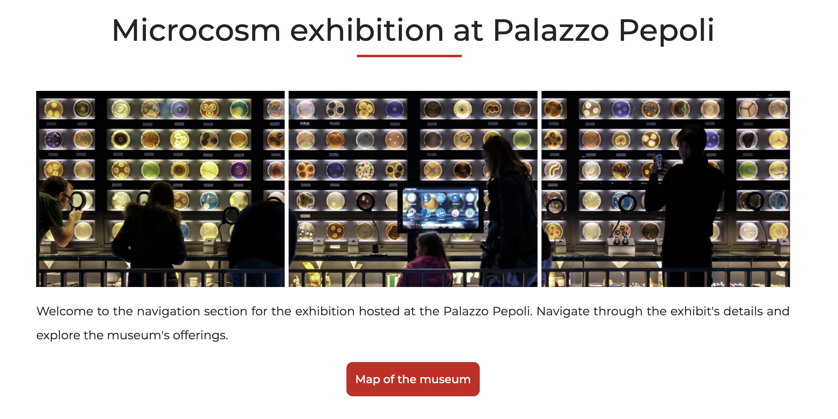
2.1.1.3 Visual Representation
2.1.2 Color Usage
2.1.2.1 Backgrounds
For the home page, narrative page, map page, documentation page, and About Us page, a white background is used. This choice is scientifically justified by several design principles:
- Contrast and Readability: White provides the highest contrast with black text, ensuring maximum readability and reducing eye strain. This is crucial for maintaining user engagement and accessibility.
- Neutrality and Focus: White acts as a neutral canvas that does not compete with the content, allowing the colorful microscopic images to take center stage.
- Perception of Space: White backgrounds can make a webpage appear more spacious and clean, enhancing the overall user experience.
For the Exhibition page, a black background is utilized. This choice serves to differentiate this key section from the rest of the website, providing a distinct visual experience. The black background helps in:
- Highlighting Details: Black backgrounds can make colors appear more vibrant and details more pronounced, which is particularly important for showcasing intricate microscopic images.
- Focus and Immersion: The dark background helps draw users' attention directly to the content, creating an immersive viewing experience.
2.1.2.2 Text
The primary color for text is black, ensuring high readability against the white background. For highlighting purposes, red is used to draw attention to key information. This approach leverages the visual impact of red to emphasize important content without overwhelming the user.
2.1.2.3 Buttons and Links
Interactive elements like buttons and links follow a consistent color scheme to ensure they are easily recognizable. All buttons are red, signifying their interactivity. When hovered over, the buttons invert to a white background with red text and borders. This design choice enhances accessibility by providing a clear visual cue for clickable items, ensuring users can navigate the site intuitively.
2.1.3 Typography
2.1.3.1 Font Choices
Fonts Used:
- Regular Montserrat
- Semi-Bold Montserrat
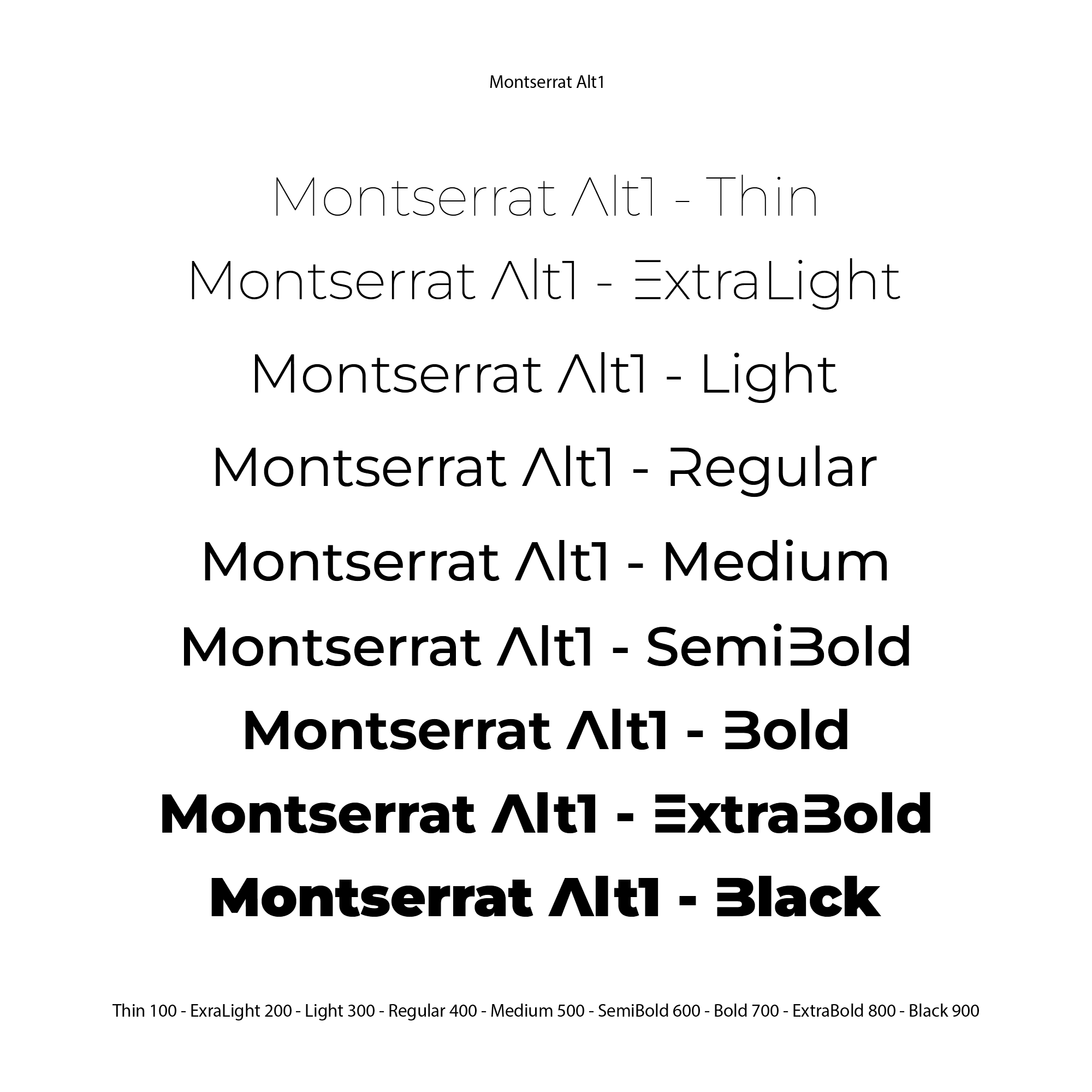
Description: Montserrat is a geometric sans-serif typeface designed by Argentine graphic designer Julieta Ulanovsky and released in 2011. It draws inspiration from posters, signs, and painted windows from the first half of the twentieth century, seen in the historic Montserrat neighborhood of Buenos Aires.
Reasons for Selection:
- Minimalistic Design: Montserrat's clean and modern geometric shapes align perfectly with our project's minimalistic design philosophy. Its simplicity does not compete with the intricate microscopic images, allowing the visuals to remain the primary focus.
- Readability: The clear and legible nature of Montserrat ensures excellent readability across various screen sizes and resolutions. This is essential for maintaining user engagement and accessibility.
- Aesthetic Qualities: The typeface's contemporary look enhances the professional appearance of the website, contributing to a cohesive and polished design.
Font Sources: Montserrat is sourced from Google Fonts, ensuring easy integration and consistent rendering across different browsers and devices.
2.1.3.2 Hierarchy and Consistency
2.1.3.2.1 Typographic Hierarchy
Different font sizes and weights are used to create a clear typographic hierarchy, making it easy for users to navigate the content:
- Headings: Semi-Bold Montserrat is used for headings, providing a strong visual anchor and making them easily distinguishable from the body text.
- Subheadings: Regular Montserrat at a slightly smaller size than headings, maintaining distinction while guiding the user through different sections.
- Body Text: Regular Montserrat in a standard size ensures readability and a comfortable reading experience.
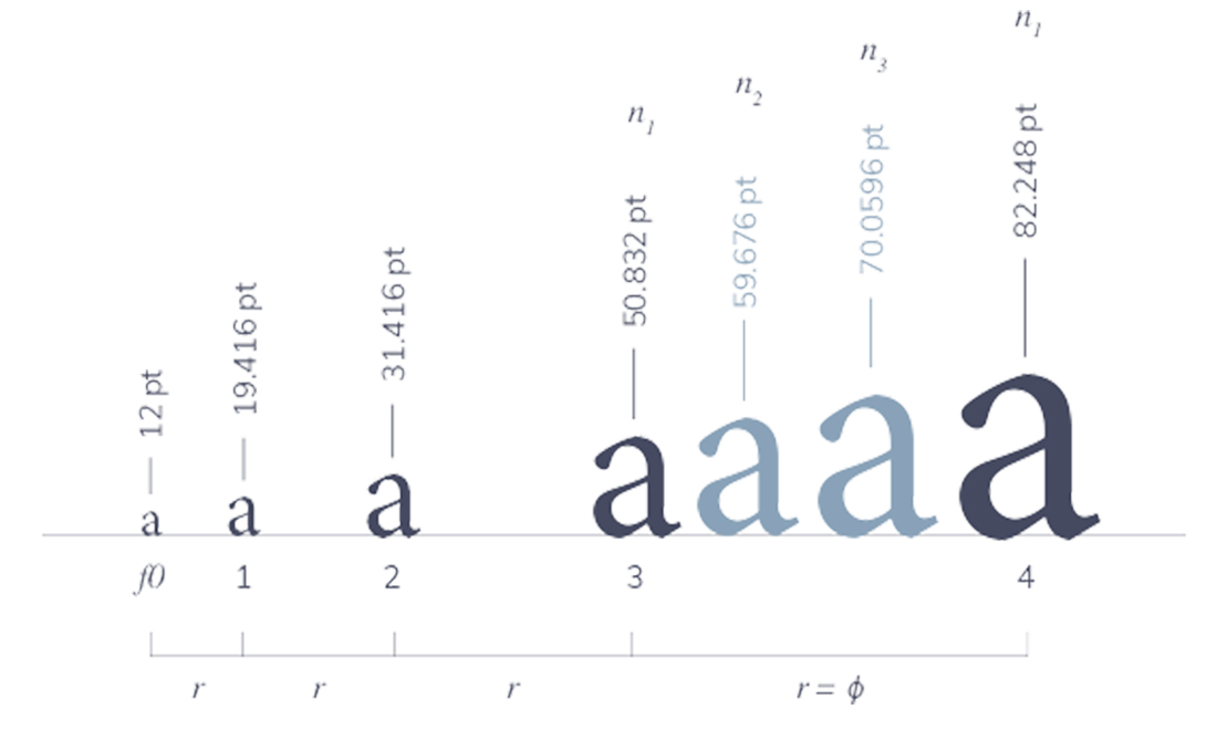
We employed a medium contrast type scale, which is effective for designs with substantial text content. Our chosen type scale is the Minor Third (1.200), which works well on both small and large screens. The line spacing for desktop is set at 1.5 (minimum for accessibility), with slightly increased spacing for mobile to enhance readability.
2.1.3.2.2 Consistency
Consistent use of typographic elements is critical for creating a cohesive and professional look across the site:
- User Experience: Consistent typography improves the user experience by providing predictable and familiar visual cues, helping users navigate the content more easily.
- Professional Appearance: A uniform typographic style contributes to a polished and sophisticated aesthetic, reinforcing the credibility of the exhibition.
- Visual Hierarchy: Maintaining a consistent typographic hierarchy ensures that headings, subheadings, and body text are easily distinguishable, guiding the user through the content logically and efficiently.
By adhering to these principles, we ensure that the typography not only complements the visual design but also enhances the overall functionality and user experience of the website.
2.1.4 Layout and Grid System
2.1.4.1 General Layout Principles
2.1.4.1.1 Positioning
Our layout employs a combination of block-level elements, Flexbox, and responsive typography to create a structured and adaptable design. Block-level elements provide a solid foundation for the layout, ensuring that content is organized into distinct sections. Flexbox is used for specific components, such as modals, to enable flexible and efficient alignment of elements within their containers. Responsive typography adjusts text size and spacing based on screen size, enhancing readability and maintaining a consistent visual hierarchy across devices.
2.1.4.1.2 Consistency
- User Experience: Consistency in layout elements, such as navigation bars, headers, and footers, ensures a predictable and intuitive user experience. Users can easily navigate the site and understand its structure without confusion.
- Visual Cohesion: A consistent layout contributes to a cohesive visual identity, reinforcing the overall design language and making the website appear more polished and professional.
- Efficiency: Consistent use of layout patterns allows for more efficient development and maintenance. Reusable components and design patterns streamline the creation of new pages and updates.
2.1.4.1.3 Responsiveness
Detailing Responsive Adaptation:
- Media Queries: We use media queries to apply different styles based on screen size, ensuring that the layout adapts smoothly to various devices. For example, adjustments are made to font sizes, padding, and margins to optimize readability and usability on both small screens and larger displays.
- Responsive Units: We primarily use rem and px for flexible element sizing. rem units scale relative to the root font size, ensuring consistent scalability across different screen sizes and user settings. px units provide precise control over element dimensions, maintaining layout integrity and alignment. This approach ensures that elements remain proportionate and aligned, preserving the design's visual consistency across various devices.
2.1.4.2 Homepage Layout
- Navigation Bar: Positioned at the top of the page for consistent access across all pages. Styled with a fixed position to ensure it remains visible during scrolling. The navigation bar is designed with a minimalist approach to avoid distracting from the primary content.
- Banner with Header: Centered at the top of the page below the navigation bar. The header is prominent, with large typography to draw attention to the project name. The "Explore More" button is styled to stand out with a red color, encouraging user interaction.
- Text Introduction Section: Positioned below the banner, with ample padding to create visual separation. Styled with a clear, readable font and ample line spacing to enhance readability and engagement.
- Narratives Section: Features a carousel layout to present different narratives. Positioned centrally with equal spacing to maintain balance and visual appeal. The carousel's design includes navigation arrows and dots for user interaction.
- Map Section: Located beneath the narratives section, with a clear link to the map page. Styled to provide a visual break and highlight the practical information about the exhibition location.
- How to Reach Us Section: Positioned at the bottom of the homepage, including an interactive Google Map for user convenience. Styled to integrate seamlessly with the rest of the page while providing essential information.
- Footer: Positioned at the very bottom of the page, styled with a consistent color scheme and layout for uniformity. It includes essential links and contact information, ensuring easy access to additional resources.
2.1.4.3 Exhibition Page Layout
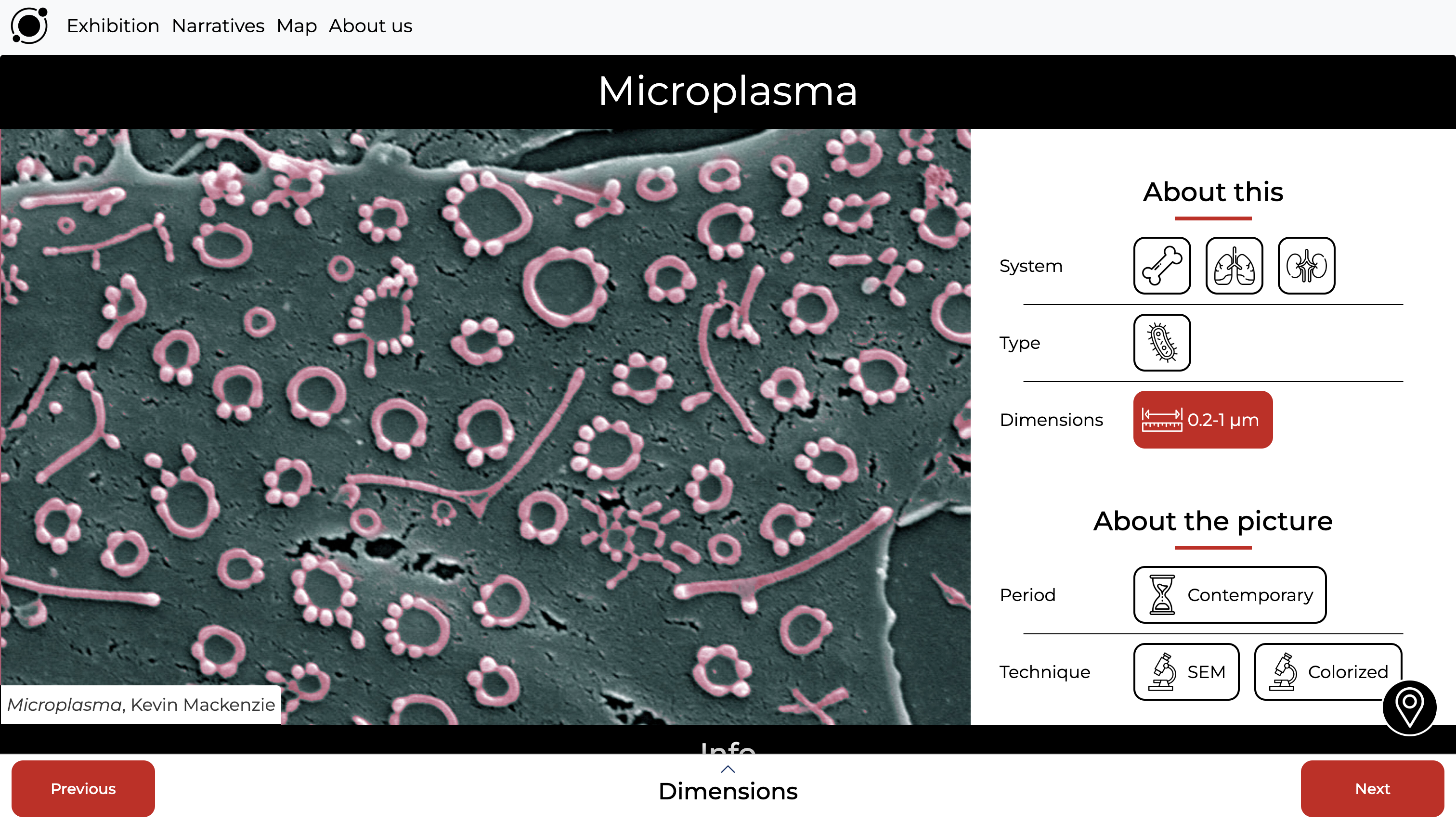
- Navigation Bar: Positioned at the top for easy access, consistent with other pages. The design is minimalistic to avoid distraction from the primary content.
- Image Placeholder: Occupies two-thirds of the page to ensure the image is the focal point. Styled with sufficient margin around it to emphasize its importance and provide visual balance.
- Navigation Console: Positioned near the top, allowing users to switch between narratives easily. Styled to blend seamlessly with the page design while remaining functional.
- Info Section: Located beneath the main image, styled with a simple design to provide contextual information without overshadowing the image.
- Slider: Positioned below the info section, allowing users to switch between images within the current sub-narrative. Styled with arrows and indicators for easy navigation.
- Footer: Positioned at the bottom, maintaining consistency with the rest of the site.
2.1.4.4 Narratives and Map Page Layouts
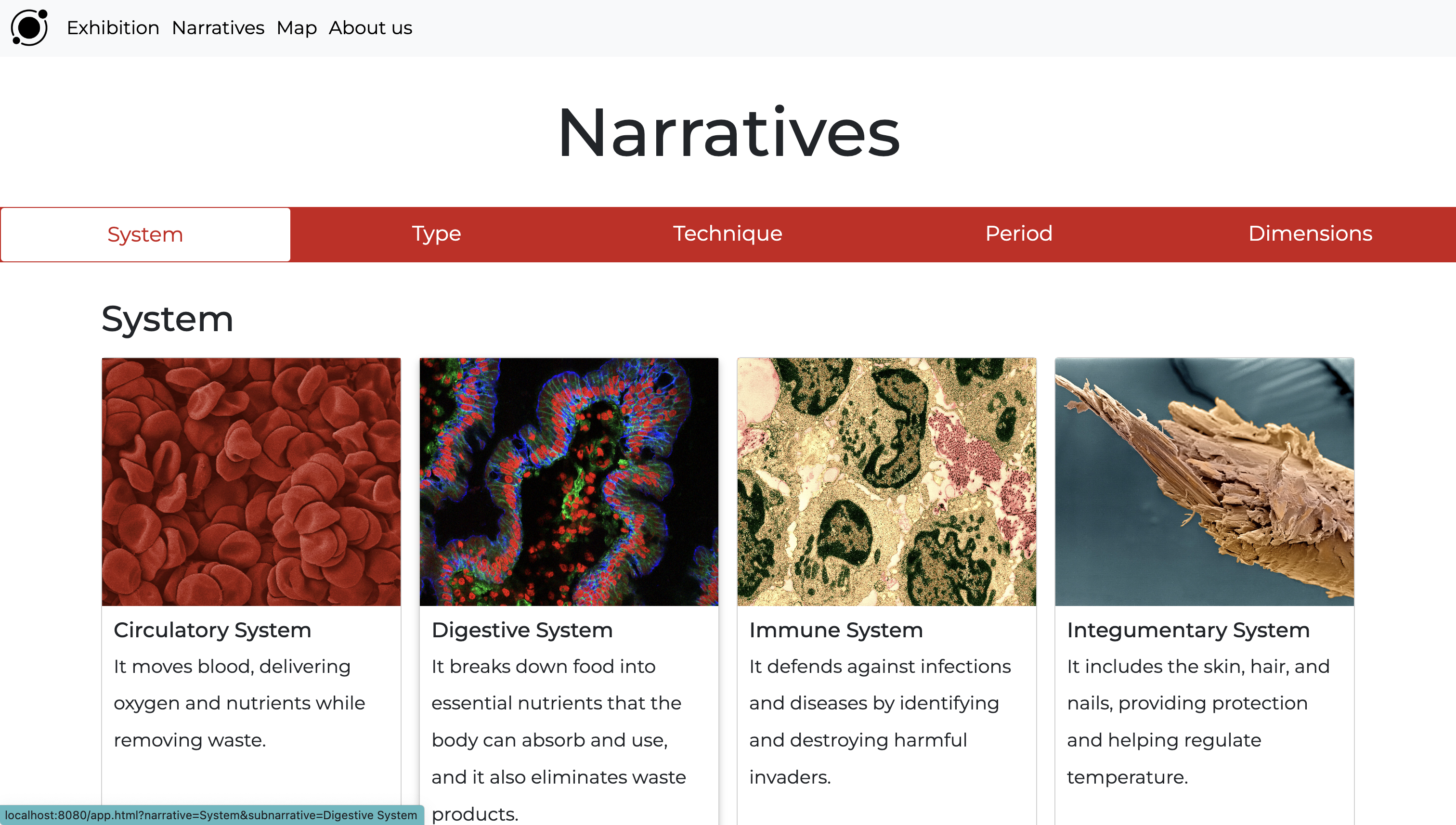
2.1.4.4.1 Narrative Page Layout
- Navbar: Positioned at the top for consistent navigation. Styled in line with other pages to maintain uniformity.
- Narrative Switcher: Positioned within the page to allow easy switching between narratives. Styled to integrate with the overall design while providing clear navigation options.
- Gallery: Positioned centrally to display cards representing different sub-narratives. Styled with sufficient spacing and clear links to ensure users can easily access the exhibition page for each sub-narrative.
- Footer: Positioned at the bottom for consistency, including essential links and contact information.
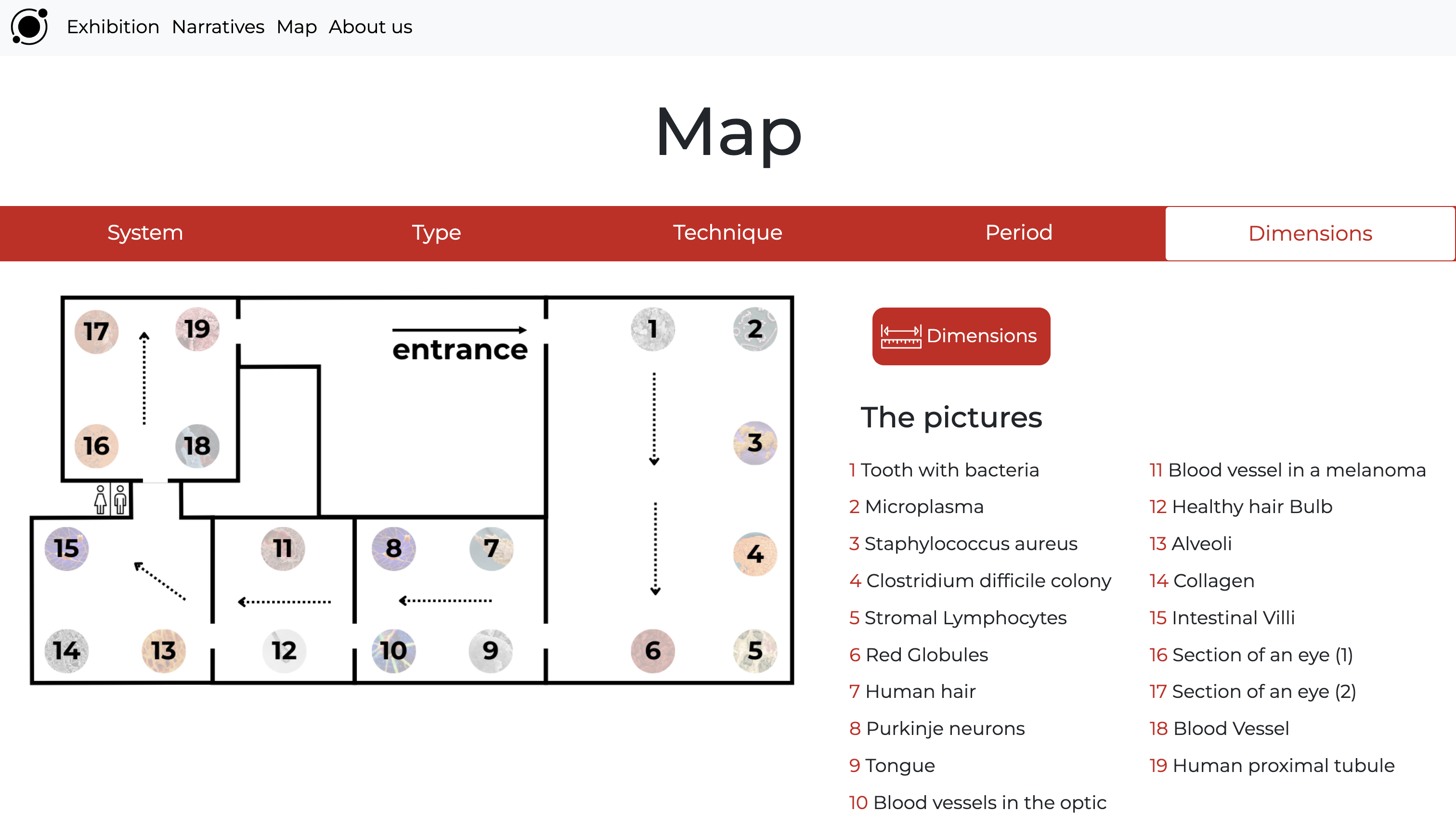
2.1.4.4.2 Map Page Layout
The Map page includes a detailed map of Palazzo Pepoli, highlighting the specific paths users should follow to view objects that belong to particular narratives. Users can select a desired narrative to see the corresponding map and a list of related items. Clicking on any item redirects users to the detailed information page for that specific item.
We included the Map page to provide users with a constant reference to the museum layout. Palazzo Pepoli was chosen for its proximity, suitable dimensions for our number of images, and its simple architectural structure, making it easier for visitors to explore in various ways.
- Navbar: Positioned at the top for consistent access, styled similarly to other pages.
- Sub-Narrative Switcher: Positioned within the page to allow users to switch between sub-narratives and view relevant map placements.
- Map: Positioned prominently to display the placement of images within Palazzo Pepoli. Styled for clarity and interaction.
- Console: Positioned below the map to display tabs with sub-narratives and associated objects. Styled to provide clear, interactive navigation.
- Footer: Positioned at the bottom, maintaining consistency with the rest of the site.
2.1.5 Iconography and Imagery
2.1.5.1 Icons
Icon Style:- Outline Design: The icons feature a minimalistic outline style, characterized by clean lines and a simple graphical approach. This design choice aligns with the overall minimalistic aesthetic of the project, ensuring that the icons do not overshadow the primary content.
 Purpose of Icons:
- Navigation: The primary function of the icons is to facilitate navigation through different sub-narratives. Each icon represents a specific sub-narrative and functions interactively as a button, allowing users to quickly switch between different categories of content.
- Consistency Across Pages: Icons are utilized consistently throughout the website, starting from the Exhibition page where they first appear, and continuing on the Map page. This consistency aids in user learning and reinforces the navigational structure of the site.
- Exhibition Page Icons: Icons are used to represent various sub-narratives, providing a visual and interactive way for users to select different categories of microscopic images.
- Map Page Icons: The same icons appear on the Map page, indicating the location of different sub-narratives within Palazzo Pepoli. This continuity helps users connect the icons with their respective sub-narratives and enhances overall usability.
2.1.5.2 Images
Types of Images:- Microscopic Pictures: The project centers around 19 microscopic images of cells, bacteria, and organs in the human body. These images serve as both content and design elements, integral to the project's presentation and narrative.
- Design Integration: Images are used not only as visual content but also as design elements. For instance, the banner on the homepage features one of the microscopic images, and the map of Palazzo Pepoli incorporates small images representing different objects within the exhibition.
- Visual Impact: The colorful microscopic images are a key visual component, contrasting with the minimalistic design of the website. Their vibrant colors add a dynamic element to the overall design, making the site visually engaging and emphasizing the significance of the images.
- Design Accent: While the website design is minimalistic with a restrained color palette, the images themselves provide a rich array of colors, breaking the monotony and drawing attention to the detailed microscopic content. This balance between a minimalistic design and colorful images enhances user experience and engagement.
2.2 Technical Design
2.2.1 JSON Structure
JSON serves as the foundation for data organization in our project, enabling dynamic content generation for our website. This approach ensures flexibility, maintainability, and reusability of the web content, which is critical for our project's success. The structured and standardized format of JSON allows seamless integration of data, making it an ideal choice for managing and organizing the exhibition's extensive and varied content.
2.2.1.1 Why JSON?
Using JSON offers several advantages for our project:
- Simplicity and Readability: JSON is easy to read and write, which simplifies data management and debugging.
- Language Independence: JSON is language-agnostic, making it compatible with any programming language, enhancing the flexibility of our web application.
- Lightweight Data Interchange: JSON is less verbose compared to XML, reducing the payload size and improving the website's performance.
- Nested Structures: JSON's ability to nest objects and arrays makes it suitable for representing complex data hierarchies, which is essential for our multi-faceted exhibition content.
2.2.1.2 Structure of JSON Data
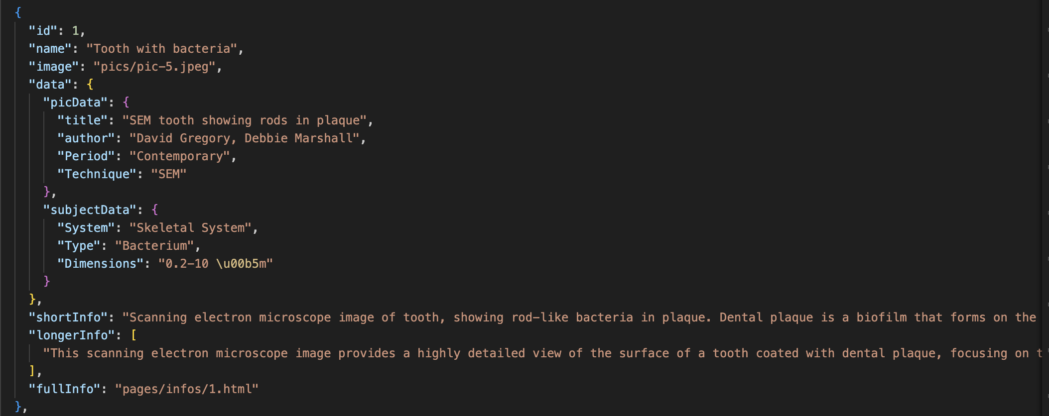
The JSON containing the data about the items is structured following the example provided by our professor. For our convenience, we modified some parts of the structure to better suit our project's requirements:
- Removal of @sort Key: We removed the @sort key, as we use the id to sort the items.
- Addition of Id: We added an id for each item to uniquely identify and sort them.
- Division of Data: We divided the data into two sections: one containing the data about the subject of the picture and the other including the data about the picture itself.
In the picData section, we included:
- title
- author
- Period
- Technique
In the subjectData section, we included:
- System
- Type
- Dimension
2.2.1.4 Narratives JSON
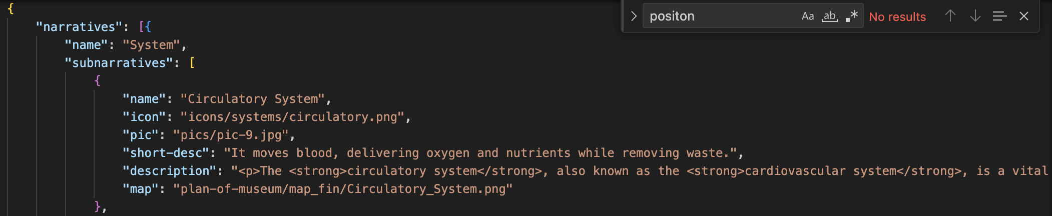
We also created another JSON file containing all the information about the narratives. This file structures the necessary information for the map page, narratives’ page, and the app, making the website fully reusable. The JSON is structured as follows:
2.2.1.5 Benefits of JSON Structure
The primary goal of our JSON structure is to make the website almost fully reusable. The only pages that must be changed manually are the homepage and the About Us page. This approach provides several benefits:
- Reusability: Developers only need to change the values in the JSON without modifying its structure, allowing easy adaptation to different exhibitions.
- Maintainability: A centralized data structure simplifies updates and maintenance, as changes can be made directly in the JSON files.
- Flexibility: The JSON structure allows for dynamic content generation, enhancing the user experience by providing up-to-date and relevant information seamlessly.
2.2.1.6 Conclusions
In summary, the JSON-based approach offers a robust and efficient solution for managing our exhibition's data. By leveraging JSON, we ensure our website remains flexible, maintainable, and reusable, providing an engaging and dynamic user experience.
3. Attribution Information
The purpose of this website is to explore various typography and layout styles for museum pages as an end-of-course project for the "Information Modeling and Web Technologies" course of the Master Degree in Digital Humanities and Digital Knowledge at the University of Bologna, under Prof. Fabio Vitali. The documents contained in this website have been selected for their length and complexity from Wellcome Collections and wikimedia commons. Their publication here is not intended to be an alternative or replacement for their original locations.
All copyrights and related rights on the content remain with their original owners.
All copyright on the typographic and layout choices are 2024 © Benini Ludovica, Casazza Simone, Ciarrocca Alberto, Pak Anna.
3.1 Public Domain Mark
- The eye, as seen through a microscope: two figures. Colour lithograph after R. Liebreich, ca. 1860. Wellcome Collection. Source: Wellcome Collection.
- The eye, as seen through a microscope: two figures. Colour lithograph, ca. 1862. Wellcome Collection. Source: Wellcome Collection.
- The eye, as seen through a microscope: three figures. Colour lithograph after R. Liebreich, ca. 1860. Wellcome Collection. Source: Wellcome Collection.
- Healthy hair bulb, taken from the book "A study of hairs and wools belonging to the mammalian group of animals: including a special study of human hair, considered from the medico-legal aspects" by John Glaister. Source: Internet Archive.
- Purple cells. Created by Yves Pommier, Rozenn Josse, 2014, National Cancer Institute via Wikimedia Commons. Source: Wikimedia Commons.
3.2 Attribution 4.0 International (CC BY 4.0)
- SEM tooth showing rods in plaque. David Gregory & Debbie Marshall. Source: Wellcome Collection.
- Microplasma. Kevin Mackenzie, University of Aberdeen. Source: Wellcome Collection.
- Villus from the small intestine. S. Schuller. Source: Wellcome Collection.
- SEM alveoli in the lung. David Gregory & Debbie Marshall. Source: Wellcome Collection.
- Split end of a human hair. Liz Hirst, Medical Research Council. Source: Wellcome Collection.
- SEM of collagen. David Gregory & Debbie Marshall. Source: Wellcome Collection.
- Blood vessels emerging from the optic disc. Freya Mowat. Source: Wellcome Collection.
- Tongue, taste bud on fungiform papilla. SEM. David Gregory & Debbie Marshall. Source: Wellcome Collection.
- Human proximal tubule, tubular structure, SEM. David Gregory & Debbie Marshall. Source: Wellcome Collection.
- Blood vessel in a melanoma, SEM. S. Gschmeissner, K. Hodivala-Dilke & M. Stone. Source: Wellcome Collection.
- Roseomonas mucosa Bacteria. Image captured by Emily Fitzmeyer and Monica Paneru at NIAID's Rocky Mountain Laboratories in Hamilton, Montana. Source: NIAID, CC BY 2.0 via Wikimedia Commons.
3.3 Attribution-NonCommercial 4.0 International (CC BY-NC 4.0)
- MRSA. Annie Cavanagh. Source: Wellcome Collection.
- Clostridium difficile colony. David Goulding, Wellcome Trust Sanger Institute. Source: Wellcome Collection.
- Ruptured blood vessel. Anne Weston, Francis Crick Institute. Source: Wellcome Collection.
- Blood Cells, SEM. Anne Weston, Francis Crick Institute. Source: Wellcome Collection.
- Massed small stromal lymphocytes - coloured. Rob Young. Source: Wellcome Collection.
- Purkinje neurons in culture. Annie Cavanagh. Source: Wellcome Collection.
Attribution-ShareAlike 4.0 International (CC BY-SA 4.0)
- Conrad Bube Reduktionsmaßstab aus Holz (Picture of a meter). Deutsches Museum / Konrad Rainer, CC BY-SA 4.0 via Wikimedia Commons.
- Scanning electron microscope - UFCH JH (2020) 01. Tadeáš Bednarz, CC BY-SA 4.0 via Wikimedia Commons.
- Transmission electron microscope. Johannes Schneider, CC BY-SA 4.0 via Wikimedia Commons.
- GodeNehler via Wikimedia Commons, CC BY-SA 4.0.
- Photographic plates GNM7091-012. Kerstin Holmstedt, source: DigitaltMuseum.se, CC BY-SA 4.0.
Attribution-ShareAlike 3.0 Unported (CC BY-SA 3.0)
- Heart anterior exterior view. Source: Patrick J. Lynch, medical illustrator, CC BY 2.5 via Wikimedia Commons.
Attribution 2.0 Generic (CC BY 2.0)
- Roseomonas mucosa Bacteria. Image captured by Emily Fitzmeyer and Monica Paneru at NIAID's Rocky Mountain Laboratories in Hamilton, Montana. Source: NIAID, CC BY 2.0 via Wikimedia Commons.
Icons
All icons used inside the app were provided by Flaticon.com.
Conclusion
Our web-based exhibition, Microcosm: Hidden Worlds Within, at Palazzo Pepoli reflects a careful blend of design principles, technical strategies, and content organization, creating a seamless and engaging user experience. Our focus on minimalistic design, effective storytelling, and efficient data management ensures that the exhibition is both visually appealing and easy to navigate.
Design Principles
- Color Scheme: We use a minimalistic palette of white (#fff), black (#000000), and red (#cc1b1b). White and black provide neutral backgrounds that enhance the vibrant microscopic images, while red is used sparingly for emphasis, evoking the color of blood and drawing attention.
- Typography: We chose Montserrat, a geometric sans-serif typeface, for its readability and modern look. Sourced from Google Fonts, it is used in Regular and Semi-Bold weights to create a clear visual hierarchy.
- Layout and Grid System: Our layout uses a 12-column grid structure, ensuring alignment and consistent spacing. Responsive design principles adapt the layout to different screen sizes, enhancing usability across devices.
- Iconography and Imagery: Outline-style icons aid navigation, and the 19 microscopic images serve as both exhibition objects and design elements, adding color and interest.
Content Organization
- Narrative Structure: Our storytelling approach guides users through the exhibition, allowing exploration of various narratives and sub-narratives via interconnected pages.
- User Pathways: Multiple pathways, including the main exhibition page, narrative page, and map page, provide flexibility and enhance the user's exploration experience.
- Visual Design: White backgrounds on most pages ensure optimal content contrast, while a black background on the exhibition page highlights the primary content. Black text is used for readability, with red for emphasis. Interactive elements like buttons are red, turning white with red text and borders on hover for accessibility.
Data Organization
- JSON Structure: JSON files facilitate dynamic content generation and efficient data management. Data is organized into picData and subjectData sections, with objects ordered by dimension in micrometers (µm).
- Narratives JSON: A separate JSON file contains narrative information, ensuring the website is reusable, with only the homepage and about us page requiring manual updates.
Location of Exhibition
The exhibition is hosted at Palazzo Pepoli, a Baroque palace in central Bologna, Italy. Its convenient location, suitable dimensions for our images, and simple architectural structure make it an ideal venue. The map page provides a constant reference to the layout of Palazzo Pepoli, enhancing navigational experience.
Final Thoughts
In conclusion, our project highlights the thoughtful integration of design principles, technical strategies, and content organization to create a compelling and user-friendly exhibition. The minimalistic design keeps the focus on the vibrant microscopic images, while well-structured JSON data ensures dynamic content generation and easy maintenance. By considering every aspect of design and data organization, we have created an exhibition that is visually engaging, easy to navigate, and fully reusable for future projects. This documentation serves as a comprehensive guide to understanding the intricacies of Microcosm: Hidden Worlds Within and the rationale behind each design and technical decision.